Two Lines Cross on the Page
OCTOBER 1, 2026
A running Bitcoin group chat I'm part of does this to me every week: someone drops a link with one line of commentary, and the thread runs off in three directions before anyone's checked the actual source. This week it was a tweet from Bitwise's CIO, Matt Hougan, pointing at a new San Francisco Fed research letter and declaring "the entire stablecoin ecosystem is going much, much higher," with "I mean... it is the San Francisco Fed!!" from the friend who shared it. A second friend's reply was narrower and sharper: look at the scale difference on the chart. A third wasn't buying the framing at all — higher in what, he asked. Debt holdings? Fiat is what fiat holds. Three reactions, one real Fed letter underneath all of them, and I hadn't read it yet either. So I did.
What the Letter Actually Says
The source is real and it says something genuinely notable: FRBSF Economic Letter 2026-26, published September 28, 2026 by Sylvain Leduc, Luiz E. Oliveira, and Aleisha Sawyer of the San Francisco Fed's own research department — not a blog post, not a think-tank note, an actual Federal Reserve Bank publication. Its core claim: over the past five years, the two largest stablecoin issuers (Tether and Circle, which together make up over 80% of the market) have increased their Treasury holdings by roughly $200 billion — more than tenfold growth — and that increase amounts to more than 40% of the decline in China's own Treasury holdings over the same stretch. Separately, since 2023, stablecoin issuers have added more short-term Treasury bills than Japan, the largest non-U.S. holder of Treasuries, has. If the recent trend simply continues, the letter projects stablecoin issuers' Treasury demand could roughly double again, to about $400 billion, by the end of 2030.
That's a real, sourced, interesting finding, and it's the honest reason to take the tweet's underlying point seriously rather than roll your eyes at another crypto-Twitter chart. Stablecoin issuers genuinely have become a new category of Treasury buyer, large enough that the Fed's own researchers thought it was worth a published letter, and the letter itself cites Bank for International Settlements research finding this demand "already large enough to have a measurable impact on short-term government bond yields." None of that is hype. It's also not what either friend in the chat was actually arguing about — the scale question and the "higher in what" question are both about a specific chart in that same letter, not about whether the underlying research is real.
The Chart — and Why the Scale Complaint Was Right
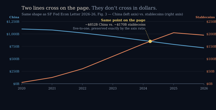
The letter's Figure 3, titled "Treasury holdings: Stablecoin issuers vs. China," is a single chart with two different y-axes: China's holdings read off a left axis running from $0 to $1,250 billion, while stablecoin issuers' holdings read off a right axis running from $0 to only $250 billion — a clean five-to-one ratio between the two scales, gridline for gridline. Plotted that way, China's declining blue line and the stablecoins' rising red line visually cross each other somewhere around 2024–2025, which is the single most eye-catching thing about the whole chart, and almost certainly the image behind "going much, much higher."
Here's the catch: a crossing point on a dual-axis chart isn't a tie. It's wherever the two series happen to land on their own, independently scaled rulers. Read the actual dollar values at that crossing — working from the chart's own published axis structure, not a pixel-perfect redigitization of the Fed's underlying spreadsheet — China is sitting around $850 billion while stablecoin issuers are around $170 billion. Same height on the page. Five times the money in reality, preserved exactly because the right axis is compressed to a fifth of the left one. A reader who glances at this chart and concludes stablecoins have "caught up to" or are "overtaking" China's Treasury footprint has been told something the two lines don't actually say. The friend who flagged the scale wasn't being a pedant about chart formatting — he'd spotted the actual mechanism making the finding look more dramatic than the Fed's own numbers support.
None of this makes the underlying research wrong, and it's worth saying plainly: dual-axis charts are a completely standard, defensible way to plot two series of very different magnitude on one timeline, and the Fed's authors label both axes clearly rather than hiding the trick — nobody at the San Francisco Fed is trying to mislead anyone here. But a chart built for a researcher who reads both axis labels is not automatically safe to retweet as a single dramatic image with no axis labels visible in the crop, and that gap is exactly where "it is the San Francisco Fed!!" turns into "the entire ecosystem is going much, much higher" without anyone checking what the lines actually measure.
"Higher in What" — the Better Question
The third friend's objection was really a different, more basic complaint, and the Fed letter answers it more cleanly than I expected. "Higher" here has one specific, narrow meaning: more dollars of U.S. Treasury bills sitting in reserve behind each dollar of stablecoin in circulation. That's it. It isn't trading volume, it isn't adoption as a payments rail, it isn't stablecoins displacing the dollar system — it's the opposite. A stablecoin's entire design promise is a fixed one-to-one peg to the dollar, and the letter spells out why: to make that peg credible, issuers hold exactly the kind of safe, liquid, dollar-denominated government debt a bank or a money-market fund would hold against depositor withdrawals. Stablecoins growing means more Treasury bills get bought to back them. "Fiat is what fiat holds" was, if anything, understating the point — a dollar-pegged stablecoin isn't an alternative to the fiat system, it's a new retail-facing pipe that ends in the same government debt every other dollar instrument ends in. The letter's own framing backs this up explicitly: stablecoin issuers are a new class of Treasury buyer, grouped with foreign central banks and money- market funds as sources of financing for the same federal debt, not a parallel system outside it.
Whether that's good or bad depends entirely on what you wanted stablecoins to be. If the pitch for you was "programmable dollars that settle instantly," the Fed letter is a quiet confirmation that the plumbing is working as designed. If the pitch was "an exit from the fiat system," this is the data point that says otherwise — the money didn't leave the Treasury market, it just arrived through a new door.
Where I Could Be Wrong
- The hero chart on this page is my own illustrative recreation of Figure 3's axis structure — matched to the letter's stated gridlines (0/250/500/750/1,000/1,250 on the left, 0/50/100/150/200/250 on the right) and to the general shape of both lines as shown in the published PDF, not a pixel-for-pixel redigitization of the Fed's own data. The authors publish their actual underlying figures as a downloadable spreadsheet linked from the letter itself; that's the number to cite if the exact year-by-year dollar figures matter to you.
- The crossing-point dollar estimate (~$850B China, ~$170B stablecoins) is read off my own recreation of the chart's geometry, not extracted from the Fed's raw data file — treat it as "roughly five-to-one, which the axis ratio guarantees at any crossing point," not as a precise historical data point.
- "More than 40%" of China's decline is the letter's own phrasing; it implies China's five-year decline is somewhat under $500 billion, but the letter doesn't state that total outright, so I haven't independently pinned down the exact figure.
- The $400 billion 2030 projection is explicitly a straight-line extrapolation, and the letter says so itself — it depends on global stablecoin regulation, competing products, and whether banks build their own faster cross-border rails, any of which could bend the trend in either direction.
- None of this is a view on whether to hold stablecoins, Treasuries, or anything else — it's a check on what one chart and one tweet actually support, not investment advice.