The Smaller Your Screen, the Bigger Your Title
OCTOBER 4, 2026
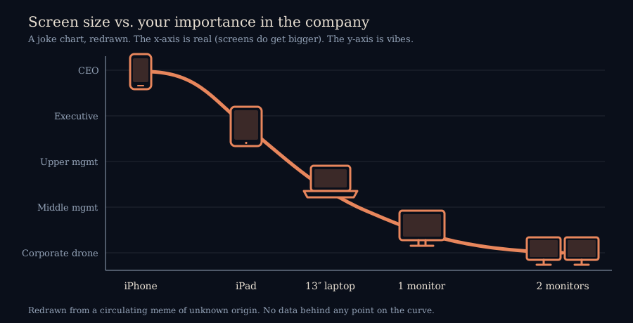
Every so often a chart goes around that is so obviously a joke, and so uncomfortably accurate, that you can't tell which one it is. This week's is titled "Correlation Between Screen Size & Your Importance in the Company." A smooth S-curve starts at the CEO, who is holding an iPhone, and slides down through the executive (iPad), upper management (a 13-inch laptop) and middle management (one monitor) before it lands, at the bottom of the chart, on whoever has two monitors. The y-axis label for that last rung is not one I'll repeat in a blog that's trying to stay on friendly terms with advertisers, but you can guess it.
I find it intriguing, and somehow true. Since this is a blog that spends its time checking charts against their sources, I owe you the checking part first.
What the Chart Actually Is
It's a meme. I don't know who drew it, and I couldn't trace it to a study, a survey or a spreadsheet. There is no data behind any point on that curve: "importance in the company" has no unit, the five job levels are a ladder of categories rather than a measurement, and the word "correlation" in the title is doing the same job a laugh track does. That's not a criticism. A cartoon doesn't owe anyone a methodology section. It just means that nothing below is a finding, and I'd be misleading you if I dressed it up as one.
One thing it does get right is the x-axis. Phones, tablets, laptops, monitors, pairs of monitors: those really do run from smallest screen to largest, so the only axis with a real ordering is the one that carries the joke's setup. The other axis carries the punchline, and the punchline is not measured.
Why It Feels True Anyway
Here is my own explanation, labelled as such. The curve is less about status than about who is handed a finished answer and who has to produce one.
- A summary fits on a phone. The further up a company you go, the more of what reaches you has already been boiled down to a headline, a number and a yes-or-no. That format reads fine on six inches of glass, between meetings, standing up.
- Raw material needs room. A person reconciling two spreadsheets, or watching a live feed against a reference table, needs the two things side by side. That is what a second monitor is for. It isn't a perk. It's the tool for the job of making the summary that someone else will read on a phone.
- The pattern isn't unique to offices. Anywhere people watch several live things at once (a trading desk is the stereotype, and a good one), the rows of screens belong to the people watching the numbers, not the ones reading the memo about them.
So the arrow in the chart may point the wrong way. A small screen isn't what makes you important; it's what's left of your day once other people have done the looking for you. If that's right, then the two-monitor person at the bottom of the curve is the one who actually saw the numbers, and the iPhone at the top is holding the version somebody else decided was safe to show.
The Part Where the Joke Breaks
Plenty of senior people run big, cluttered desks. Plenty of junior people work on one laptop screen, or on a phone, because their job is in the field and not at a desk. And a second monitor costs somewhere in the low hundreds of dollars, which is a very cheap way to climb or fall on this chart if you believed it. I haven't looked up current prices for this post, so treat that range as a rough impression. Nobody should buy or sell a monitor to move up the curve.
There's also a quieter way the joke fails. It assumes the people at the top want smaller screens. It's at least as likely that they just aren't at a desk much, so the device that is always in the pocket wins by default. That would make the chart a map of where people sit, not of how much they matter.
Why It's Here
This blog is mostly about money and the people who count it, so a joke chart about office hierarchy is a detour. But it's the same lesson as the dual-axis chart from earlier this week, in a lighter key: a clean curve is not a finding, and the shape of a line tells you what the author wanted you to feel before it tells you what happened. This one wanted you to laugh. It worked on me.
Where I Could Be Wrong
- I have no source for the chart. I don't know who made it, when, or whether the version I was sent is the original or a re-share of one, so the redrawing here is mine and its details may differ from the original.
- The "summary versus raw material" explanation is my own theory. I haven't found or cited any survey of what devices people at different levels of a company actually use, and I'd expect the real answer to vary a lot by industry.
- The trading-desk remark is a stereotype I'm repeating from general impression, not a figure I've checked.
- The monitor price range is a rough guess, not a quote.
- None of this is career or buying advice. It's a joke chart and a blogger's hunch.